
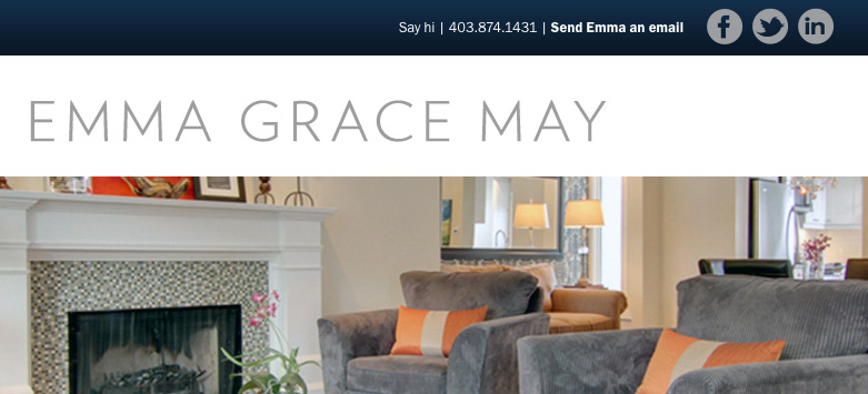
One of the latest projects I’ve had the privilege of working on with Inspire Studios in Calgary is Emma Grace May’s Realtor Website.
Inspire approached Brightside Studios (my company), in January looking to re-build Emma Grace May’s website. They were particularly interested in my experience building responsive websites. For those of you that do not know what that means, let’s let Wikipedia do the talking:
Responsive web design (often abbreviated to RWD) is an approach to web design in which a site is crafted to provide an optimal viewing experience—easy reading and navigation with a minimum of resizing, panning, and scrolling—across a wide range of devices (from desktop computer monitors to mobile phones).
I have a lot of experience designing and building Responsive websites, as I completely believe in the theory “Mobile First“. I admit, not all of my websites are built entirely mobile-first; there are sometimes variables that can make building a responsive website not a priority (budget, time, size of the website, etc.) But for the clients who come to Brightside Studios looking for a responsive website, boy, do I give it to them 🙂

Emma Grace May’s new Realtor website now boasts a minimal design with a fully responsive framework.
Head on over to emmagracemay.com to check it out. And don’t forget to resize your browser to see the responsive magic 😉
