Web Designer’s Guide to CSS Flexbox for Modern Website Layouts

CSS Flexible Box Layout, more commonly referred to as "Flexbox," is a CSS layout model that has been gaining popularity in the web design world lately.

In the past, flexbox was seen as an alternative to float-based layouts, but now flexbox is being used for more than just page layout, and it's becoming increasingly important to know how flexbox works because it's so versatile and powerful!

What is Flexbox, and how does it work?

CSS Flexbox is a layout model that allows you to create efficient, flexible, and attractive web page layouts. Flexbox works by giving you control over how your content behaves when it's resized or rearranged, making it a great tool for creating modern, responsive website designs.

One of the best things about flexbox is that all major browsers support it, so you can use it with confidence on any website. In this article, we'll be looking at the basics of how flexbox works, and we'll take a closer look at some of the things you can do with it. Let's get started!

A Brief History of Web Design Layout Techniques

Flexbox is quickly becoming the go-to technique for creating modern, responsive website layouts. But why is flexbox so popular? What are the benefits of using flexbox over traditional float-based layouts?

To help us better understand how website layouts are created today, we need to go back in time to better understand how layouts used to be created.

How Web Designers Used to Create Layouts

The 90s: HTML Tables

In the past, website layouts were often created using HTML tables. This was a very inefficient way to create layouts because it required a lot of HTML markup and made it difficult to rearrange content.

The 2000s: CSS Floats

CSS Floats are a way of positioning elements on a web page. They allow you to create multiple columns of content and control the alignment and flow of your content. When CSS floats were introduced, website layouts became much easier to create.

While floats are a very useful tool, they also have some downsides. One of the biggest problems with floats is that they can be difficult to understand. In addition, floats can be problematic when it comes to responsive design.

In responsive design, website layouts change depending on the screen size and resolution of the device being used. This can be a challenge with floats because they often don't work well when content is resized or rearranged.

One of the main problems with floats is that there is a lot of manual calculation involved in creating layouts with them. This can be difficult and time-consuming, especially if you need to create multiple responsive layouts.

Enter CSS Flexbox

Flexbox solves this problem by giving you more control over how your content behaves. You don't have to worry about calculating the layout manually with flexbox. Flexbox will do all the hard work for you!

Flexbox vs. Floats for Layout

Flexbox

Flexbox doesn't require any math! With Flexbox, you simply define the overall width of your layout, and the boxes will automatically resize as needed.

Flexbox is more flexible than floats.

Flexbox gives you more control over how your content behaves, making it a better choice for more complex layouts.

Flexbox is supported by all major browsers. This means that you can use it confidently on any website, regardless of which browsers the users are using.

Flexbox is easy to use. With just a few simple rules, you can create attractive and responsive web page layouts with flexbox.

Floats

With floats, you have to manually calculate and specify the widths and margins of all your boxes. This can be a lot of work, and it's easy to make mistakes.

Floats are great for creating simple columnar layouts, but they can be a bit inflexible when it comes to more complex designs.

Floats requires you to use media queries to manipulate your layouts.

Floats require a "clear fix" in order to prevent unwanted layout surprises.

Floats are notoriously confusing for beginner web designers.

How to use Flexbox in your Websites

Now that you know what flexbox is and why it's such a helpful tool, let's look at how you can use it in your projects.

Main Axis vs. Cross Axis

Before we dig into the Flexbox properties and values, we're going to use some terminology around Flexbox that you'll need to be aware of, specifically, "main-axis" and "cross-axis".

source: https://developer.mozilla.org/en-US/docs/Learn/CSS/CSS_layout/Flexbox

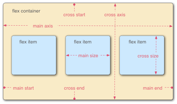
The main axis is the direction in which your content will flow, and the cross axis is perpendicular to the main axis, like a cross (hence the name).

At first glance, one may assume the main axis is the "horizontal" axis, and the cross axis, the "vertical", but nay, one would be incorrect! The main axis depends on the direction you set your flexbox layout to be, which can be in a row-based layout (horizontal), or a column-based layout (vertical).

For example, if you set your flex-direction to row, then your layout will be horizontal, and thus, your main axis would be horizontal (and your cross axis, vertical). But if you set your flex-direction to 'column', then your main axis would be vertical, and your cross axis, horizontal.

Got it?

A key fact to remember is that Flexbox is not a single property, rather, it is an entire module, so there are a whole bunch of properties you must know.

So let's learn what the most common properties are, and then get our hands dirty to learn how they work in practice!

There are two categories of Flexbox properties: Properties that apply to the Parent (henceforth referred to as Flex Container), and properties that apply to Children (henceforth referred to as Flex Items).

Parent Properties

Properties that apply to the parent flex container

display

The display property controls how a container behaves when it's applied to the page. There are two flexbox-related values you need to know. Think of this as "switching on" Flexbox.

  • flex: This is the default value, and it causes the flex container to become a flexbox. The items inside the container will be laid out according to the flexbox rules.
  • inline-flex: This value causes the flex container to behave like an inline box. The items will be laid out one after the other, similar to how they would be laid out if they were all in a single line.

See the Pen Flexbox: display by Brad Hussey (@bradhussey) on CodePen.

flex-direction

This property defines the direction in which your content will be displayed. You can use it to create horizontal or vertical layouts, or switch between the two depending on the context.

There are four flex-direction values to choose from:

  • row: This value will create a row layout, with the content displayed from left to right.
  • column: This value will create a column layout, with the content displayed from top to bottom.
  • row-reverse: This value will create a row layout, but with the content displayed from right to left.
  • column-reverse: This value will create a column layout, but with the content displayed from bottom to top.

See the Pen Flexbox: flex-direction by Brad Hussey (@bradhussey) on CodePen.

flex-wrap

This property determines how your content will wrap when it doesn't fit in the defined layout. You can use it to either wrap your content or overflow it.

There are three flex-wrap values:

  • nowrap: This value will prevent the content from wrapping, so it will overflow the container if it doesn't fit.
  • wrap: This value will cause the content to wrap when it doesn't fit, creating a new row or column as needed.
  • wrap-reverse: This value creates a layout where the content wraps in the opposite direction, from bottom to top instead of from top to bottom.

See the Pen Flexbox: flex-wrap by Brad Hussey (@bradhussey) on CodePen.

flex-flow

This is a shorthand property that combines the flex-direction and flex-wrap properties into a single value.

See the Pen Flexbox: flex-flow by Brad Hussey (@bradhussey) on CodePen.

justify-content

The justify-content property sets the alignment of items within a flex container along its main axis.

  • flex-start: this value aligns the items at the start of the container
  • flex-end: this value aligns the items at the end of the flex container.
  • center: This value aligns the items in the middle.
  • space-between: this value sets the spacing between items in a flex container. You can use it to create equal spacing between all items, or to space items out evenly along the main axis.
  • space-around: This value sets the spacing between items in a flex container to be equal on all sides, except the items at the beginning and the end of the container, which have a "half-sized space" from the edge.
  • space-evenly: This value sets the spacing between items in a flex container to be equal on all sides.

See the Pen Flexbox: justify-content by Brad Hussey (@bradhussey) on CodePen.

align-items

The align-items property sets the alignment of items within a flex container along its cross axis. You can use it to center items, align them at the start or end, or stretch them out to fill out the container equally.

  • stretch: this is the default value for the align-items property, and it stretches all of the items to fill the container equally (while respecting height and width constraints).
  • flex-start: This value will align all of the items at the start of the cross axis.
  • flex-end: This value will align all of the items at the end of the cross axis.
  • center: This value will center
  • baseline: This value will align all of the items at their contents' baselines. A baseline is the "line" on which a letter typically "sits" (i.e. think back to when you were learning to write the alphabet in your journal and your teacher would make sure your letters were sitting properly on that line...that's the baseline)

See the Pen Flexbox: align-items by Brad Hussey (@bradhussey) on CodePen.

align-content

The align-content property sets the alignment of the flex container's content along its main axis. You can use it to center the content, align it at the start or end, provide equal space between content, or stretch it out to fill out the container equally.

  • normal: This is the default value and the items are packed in a, well, pretty normal fashion as if nothing is happening.
  • stretch: This value distributes the items evenly within the container.
  • flex-start: This value will pack items at the start of the container.
  • flex-end: This value will pack items at the end of the container.
  • center: This value will pack items around the center of the container.
  • space-between: This value will distribute items evenly with the first item being flush with the start of the container and the last item flush with the end.
  • space-evenly: This value will distribute items evenly with the first and last items having "half-sized" spaced at the start and the end of the container.

See the Pen Flexbox: align-content by Brad Hussey (@bradhussey) on CodePen.

gap

The gap property applies to both Flexbox and CSS Grid and controls the minimum amount of space between items.

See the Pen Flexbox: gap by Brad Hussey (@bradhussey) on CodePen.

Children Properties

Properties that belong to flex items only

order

The flexbox order property sets the order in which items within a flex container are laid out. Items with a lower order value will be laid out before items with a higher order value. The default is 0.

See the Pen Flexbox: order by Brad Hussey (@bradhussey) on CodePen.

flex-grow

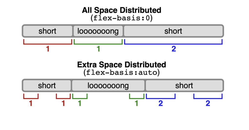
The flex-grow property controls how much an item should grow relative to the other items in the container. Items with a higher value for this property will take up more space items with a lower value. It's important to note that items with more content will take up proportionally more space than items with less content. For example, if all items have the same amount of content and a flex-grow value of 1 then they will all be equal in size within the container, but if the boxes have variable content and a flex-grow value of 1, then the available space will be distributed proportionally to each item. If one of the items has a flex-grow value of 2 while all other items have a value of 1, then the item with the value of 2 will attempt to take up twice as much space as the other children. The default value of flex-grow is 0.

flex-shrink

The flex-shrink property controls how much an item shrinks to make room for other items in a flex container. The default value of flex-shrink is 1, which means that the item will shrink by one full unit of available space. You can change this value to make the item shrink more or less, depending on your needs.

flex-basis

The flex-basis property sets the initial size of a flex item. You can set the value to be a measurement, like 20px, or a keyword, like 'fill' or 'content'. Depending on the value, the item's default size will change. The default value of flex-basis is auto.

flex-basis

See the Pen Flexbox: flex-grow by Brad Hussey (@bradhussey) on CodePen.

flex

This is the shorthand property that combines flex-grow, flex-shrink, and flex-basis. The syntax is as follows:

flex: [flex-grow] | [flex-shrink] | [flex-basis];

The default values are:

flex: 0 1 auto;

In the longhand version, this reads as:

flex-grow: 0; /* items do not grow */

flex-shrink: 1; /* items can shrink smaller than their flex-basis */

flex-basis: auto; /* items will be sized based on their content and the available space */

See the Pen Flexbox: flex-shrink by Brad Hussey (@bradhussey) on CodePen.

align-self

The align-self property allows you to override an item's default alignment or the alignment set by the 'align-items' property on the cross-axis.

See the Pen Flexbox: align-self by Brad Hussey (@bradhussey) on CodePen.

Flexbox Resources

Below are some additional CSS Flexbox resources for you to explore.

If you liked this lesson, watch my the other Flexbox lessons or join my Ultimate Web Designer & Developer course on Udemyor access all of my web design & development courses at Code College.

Wrap Up

And that's all, folks! In this guide, we've learned all about how to use CSS Flexbox to easily create layouts without all of the math and tinkering we had to once do with its predecessors, like CSS Floats. We've covered the basics, learned about the main properties and their respective values, got our hands dirty with some code, and now it's your turn to take it from here! Play around with Flexbox, become more familiar with it, and create some responsive layouts in your projects! I hope you found this guide useful on your web design and web development journey.

Until next time, now go build something!

Brad

← Previous
Next →